top of page
Graphic Design
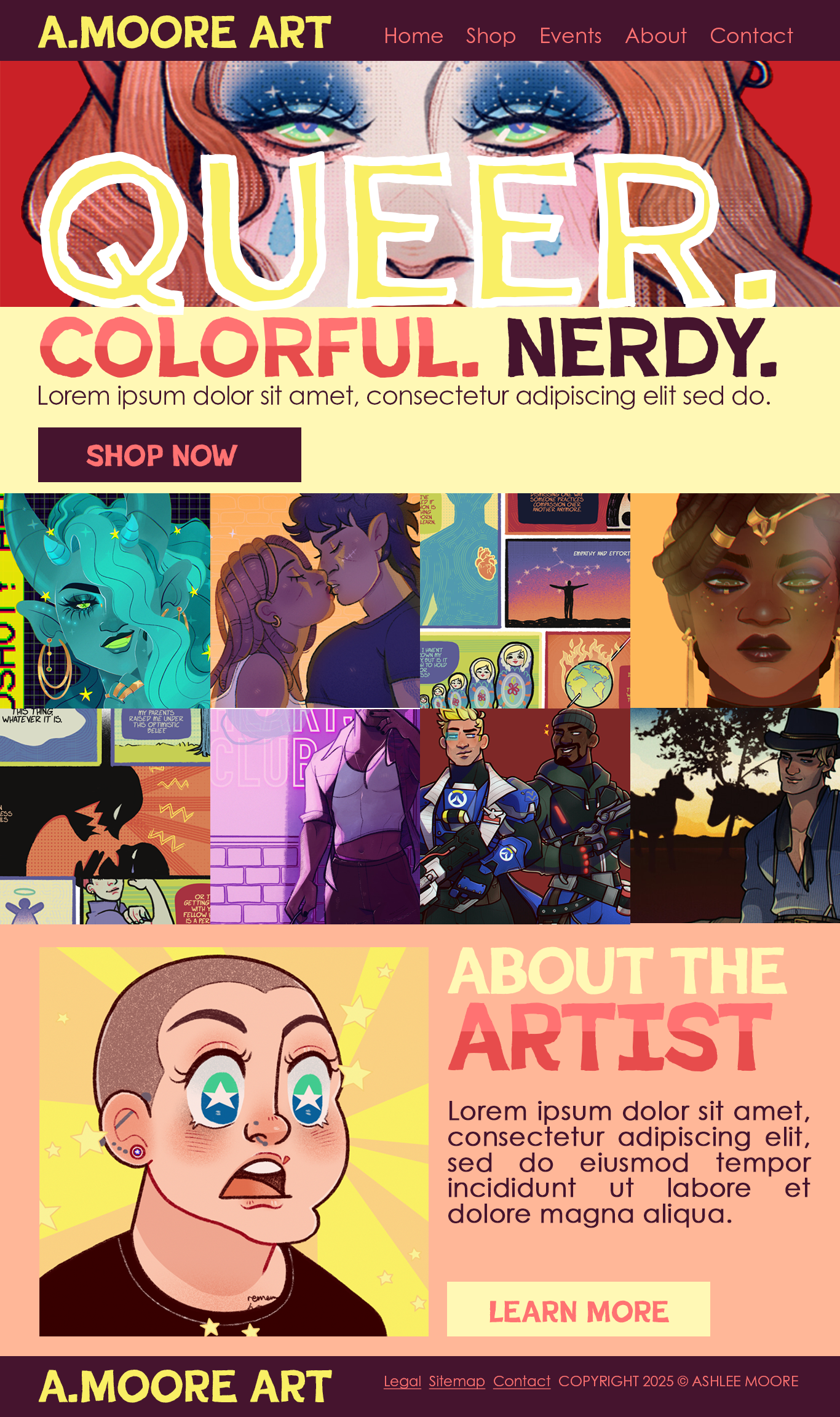
Web Landing Page
I started by figuring out my color story. I sell my artwork online, and over the last several years I’ve curated a color scheme for my social media profiles, business cards, etc. Because this web landing page is a portfolio, I wanted it to be image heavy and for the artworks to embody my H1 (i.e. “Queer. Colorful. Nerdy.”) It was also important for the fonts to be extremely accessible but quirky because that’s what I want my brand to be. Made in Photoshop.
Magazine Cover
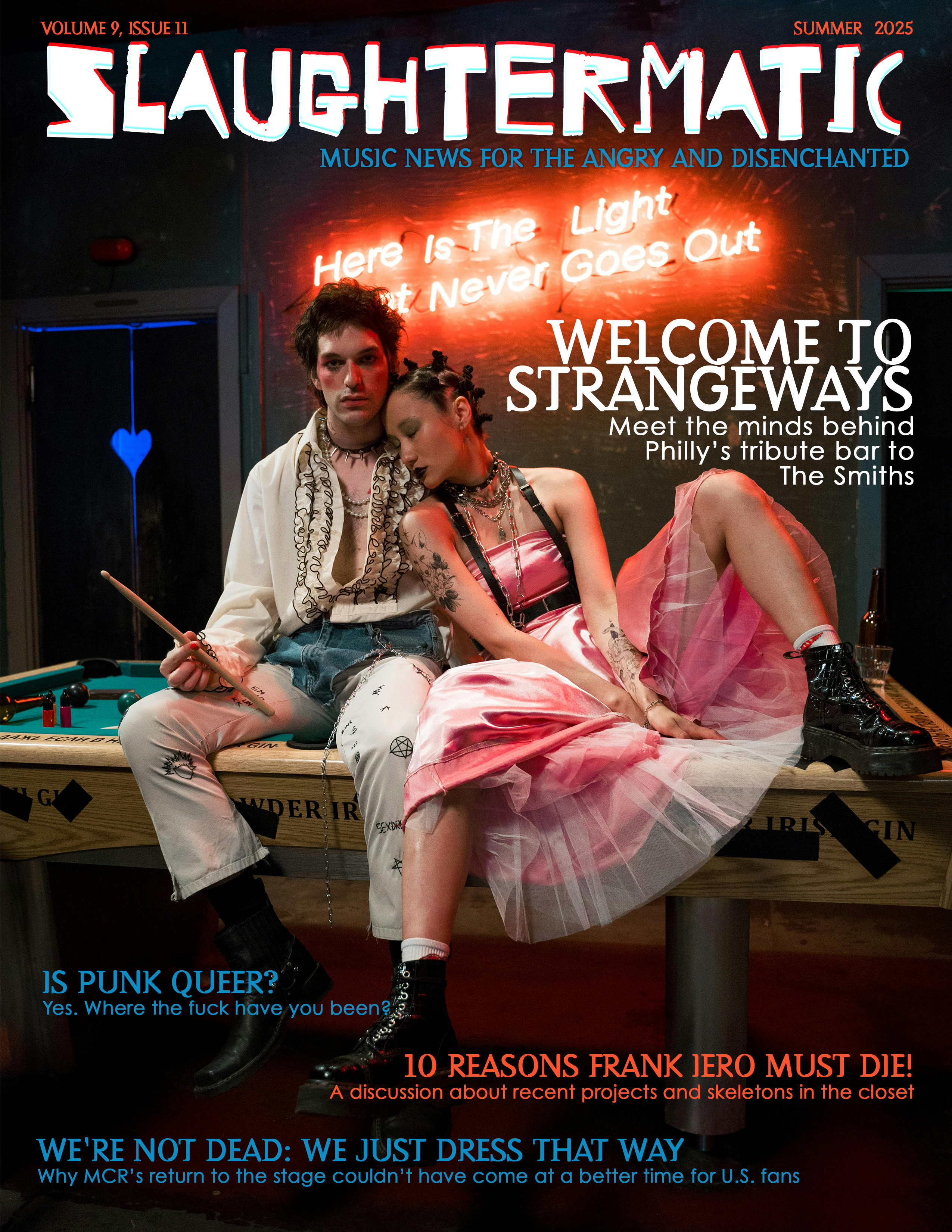
I knew I wanted to create a magazine that I could sneak little MCR Easter eggs into, so I visited Pexels and used keywords like “punk” and “goth” to find this stunning photo shoot from user @cottonbro. This photo was so good that my work was practically cut out for me. I recognized the vague reference to The Smiths and built the cover story from there. I used three different fonts: one for the magazine title, one for the heds, and one for the deks. Made in Photoshop.
Magazine Spread
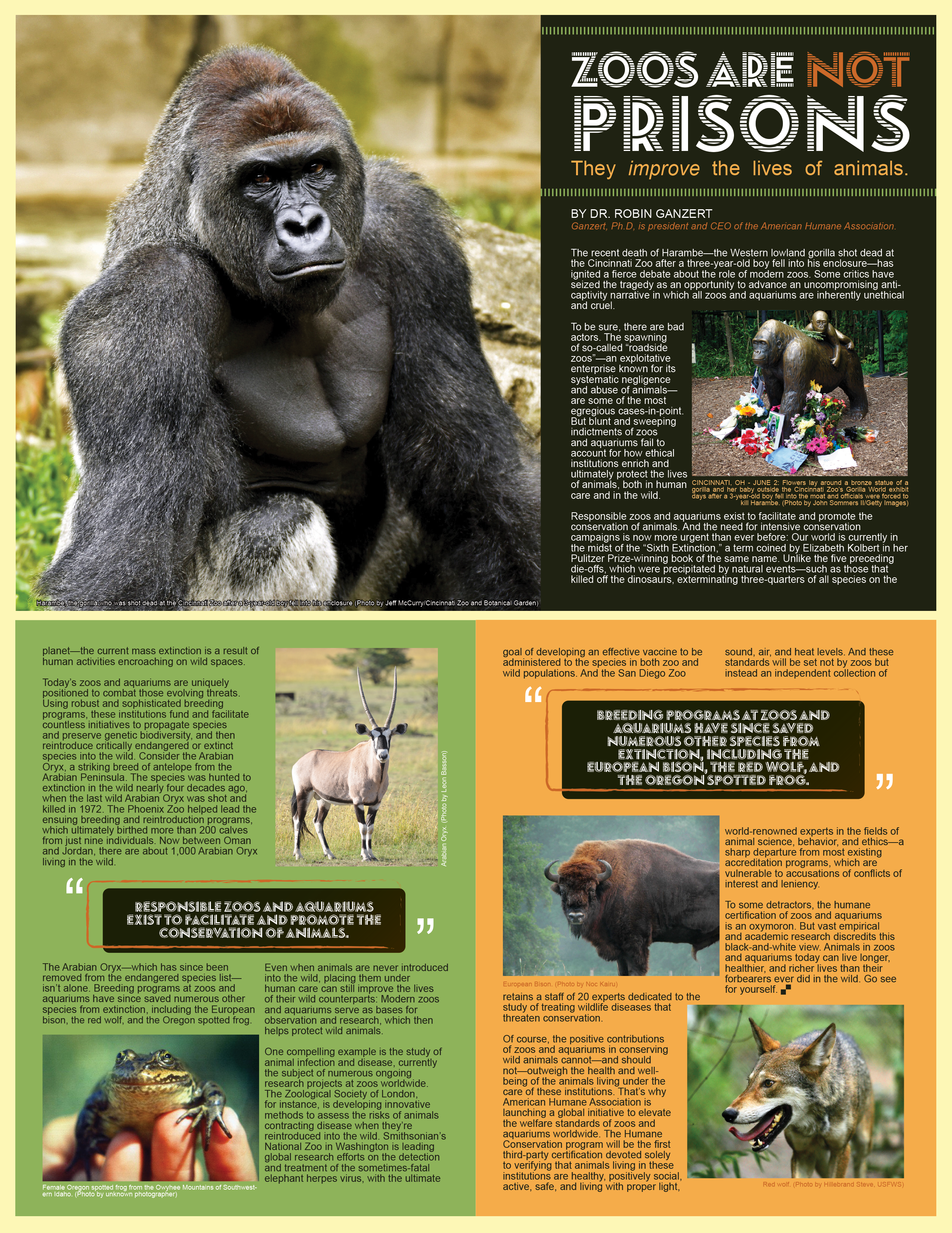
All the assets for this spread were provided—all I had to do was make sense of them. Since this is covering a story about zoos, I figured safari-like colors would complement the content. I’m a fan of bold pull quotes, and I used the vertical lines to represent the bars of a cage. Made in InDesign and Illustrator.
Logo
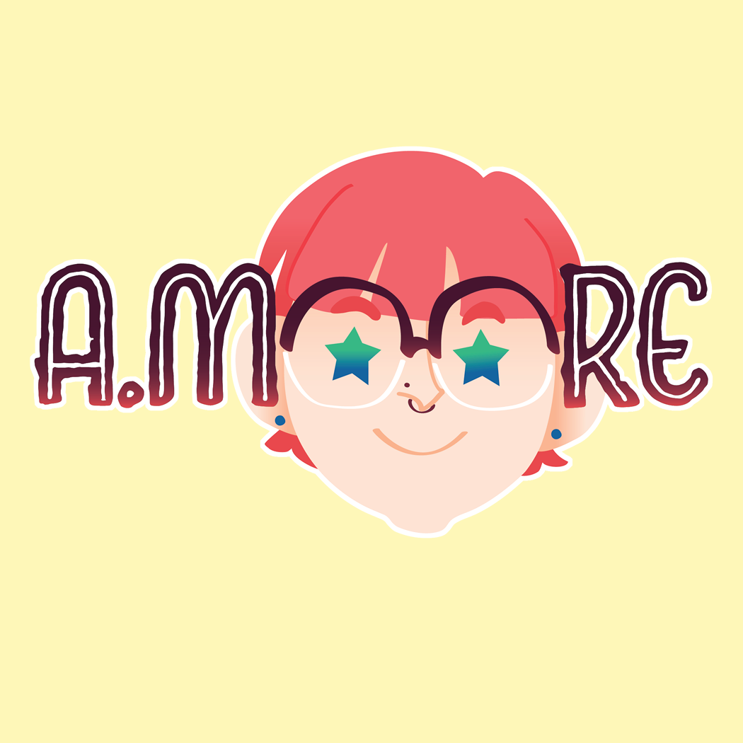
I’m an illustrator, so I wanted to include art in my logo. I thought it would be creative to use my glasses to help spell my name. I wanted brand continuity, so I used the same color scheme from my website in my logo. Made in Illustrator.
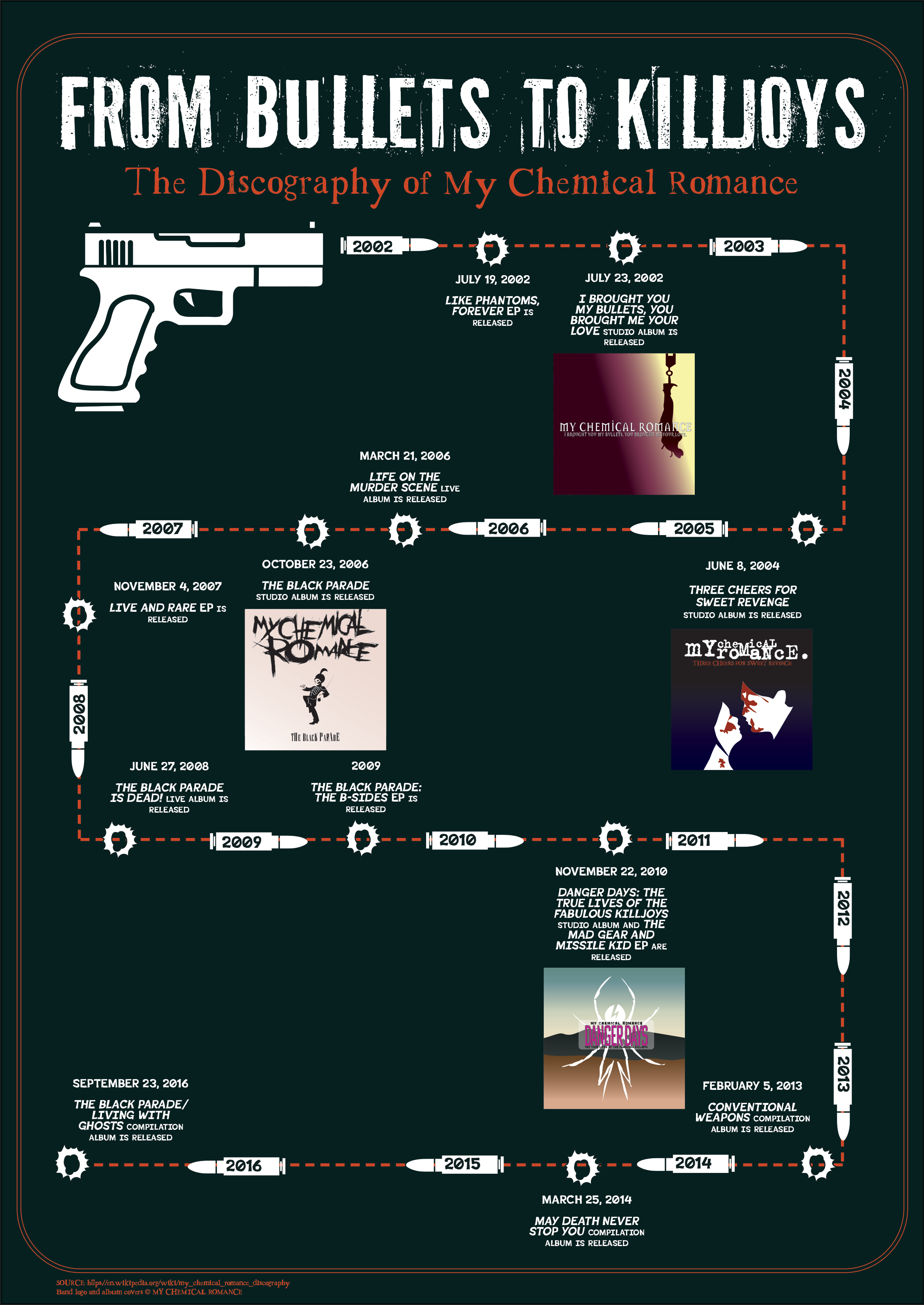
Timeline Infographic
MCR uses recurring motifs around weapons, so I wanted to create an infographic that looked like a gun firing multiple bullets along a timeline. First, I recreated their four major studio albums, along with vectors for the bullets, gun, and bullet holes. This required matching fonts as close to the original as possible. I chose fonts that were grungy but still readable. Made in Illustrator.
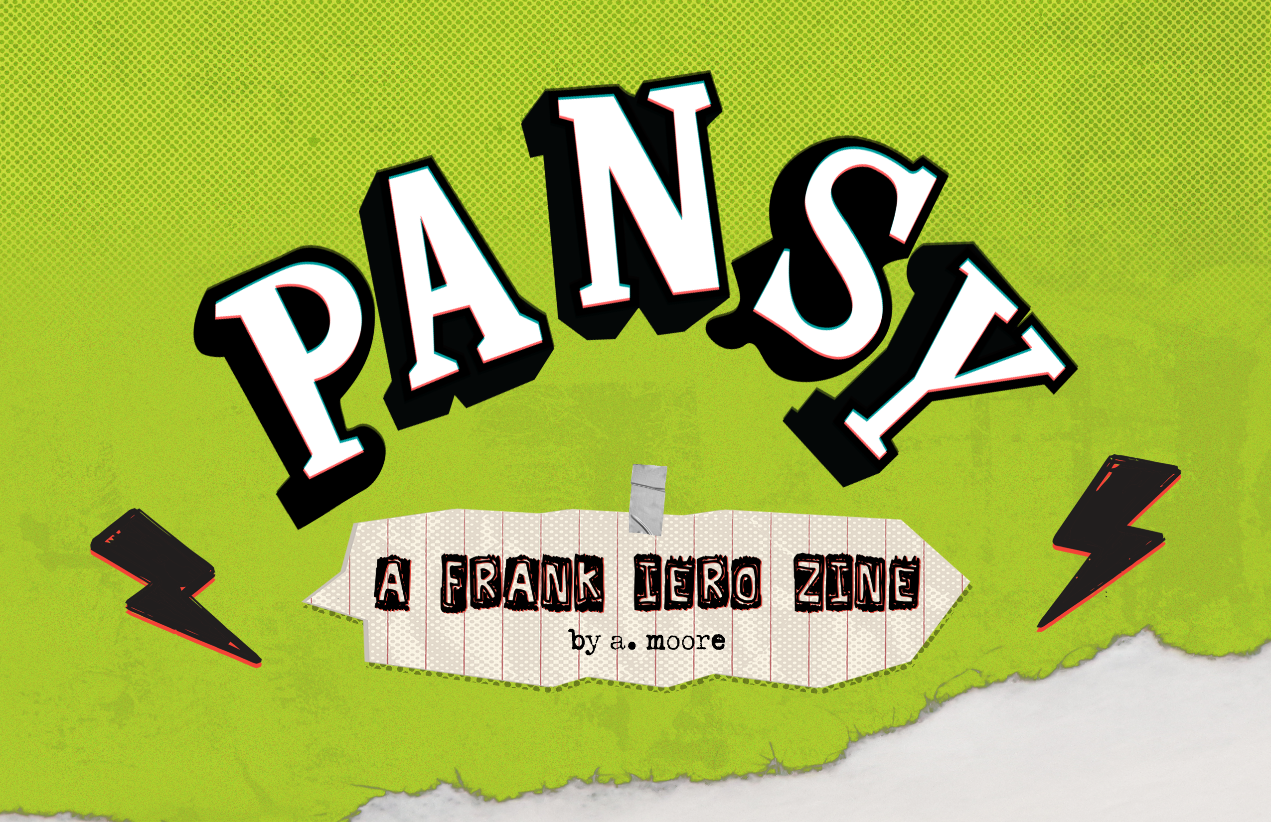
Zine Cover
Frank Iero is a weird little Halloween man, and I wanted to create a zine that matches his chaotic energy. The inspiration for this was scrapbooks, but I put a grungy spin on it using screentones, vectors, and textures from Pixabay. I recreated the “Pansy” sticker from his guitar of the same name. Made in Illustrator and Photoshop.
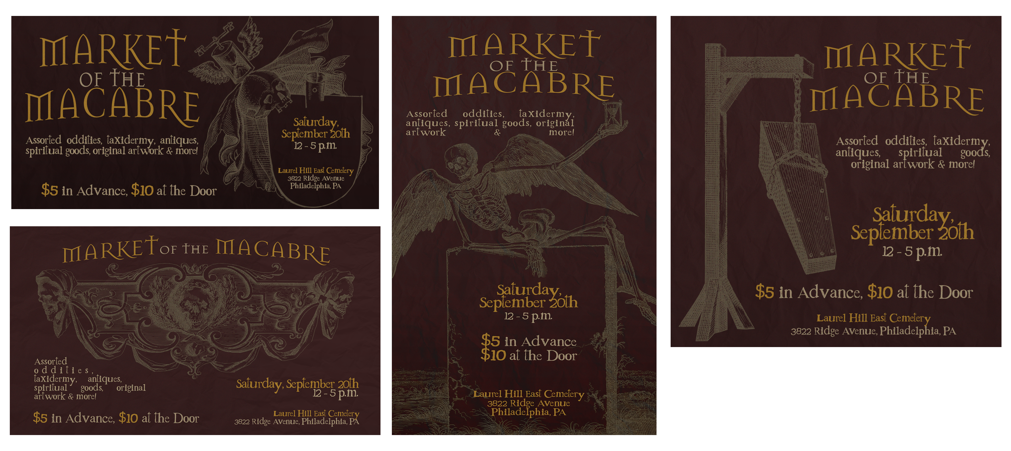
Social Media Package
I wanted to push myself from using the reds or blacks people associate with “macabre.” I found Victorian-esque illustrations on Pixabay and used those to guide the layout of the text. Since the event was at Laurel Hill, I wanted the primary font to be reminiscent of tall iron gates or a mausoleum—both of which Laurel Hill has plenty of. Made in Photoshop.
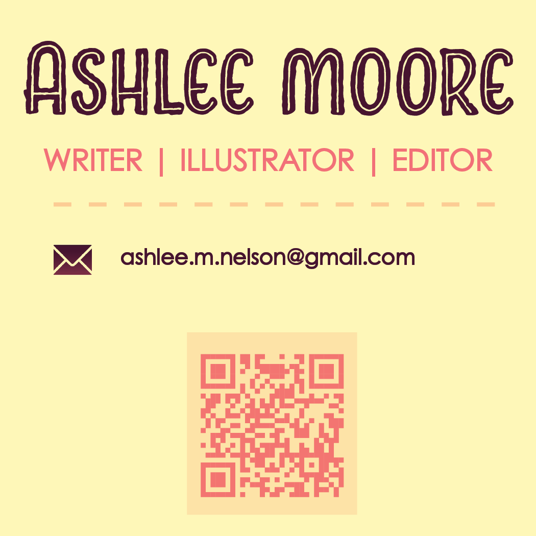
Business Card
My business card reuses the font from my logo, as well as the color palette from my website design. I don’t like traditional business card sizes, so I went with square. I’ve found that business cards that have a unique size tend to be more memorable to potential clients when handing them out. Made in InDesign.
bottom of page